The Charts Show Percentage Of People Working In Different Sectors In Town A And Town B

Sample report
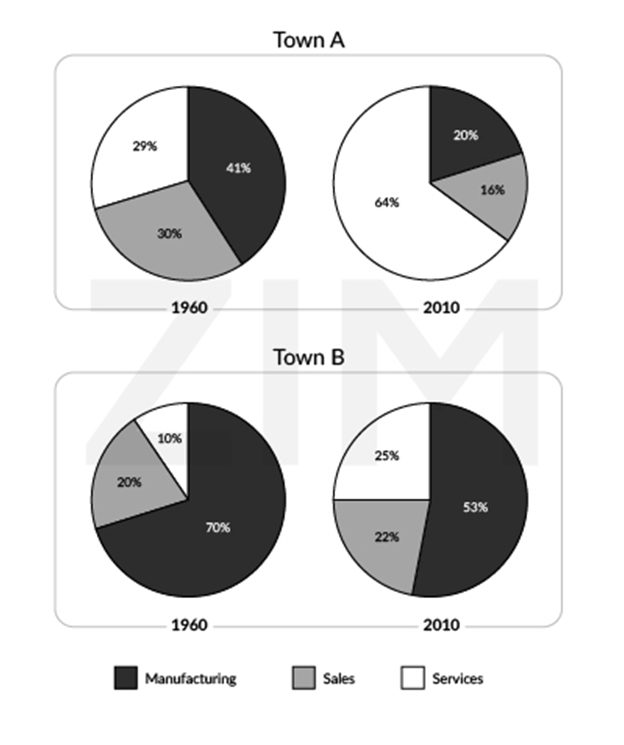
The charts reveal data about the proportion of individuals pursuing careers in various sectors in town A and town B in the years 1960 and 2010. In both Town A and Town B, the majority of people worked in the manufacturing sector in 1960. While Town A had 41% of its residents working in this field, town B had as much as 70% of its people engaged in manufacturing. The proportions of people who worked in sales and services in the same year in Town A were 30% and 29% respectively. Meanwhile in Town B in the same year, 20% of the people worked in sales and 10% worked in services. By 2010, most of the residents of Town A had switched to the services sector with 64% of them working in this sector. The percentage of people who worked in manufacturing and sales were 20% and 16% respectively. Town B also saw a drop in the percentage of people working in manufacturing over the years. Only 53% of them worked in this sector in 2010. Meanwhile the percentage of Town B residents who worked in the services sector jumped from 10% in 1960 to 25% in 2010. Those working in the sales sector increased marginally from 20% in 1960 to 22% in 2010.
Need help with IELTS writing? Get your essays, letters and reports corrected by me.