The Charts Show The Proportion Of Expenditure By Students At One University
Sample report
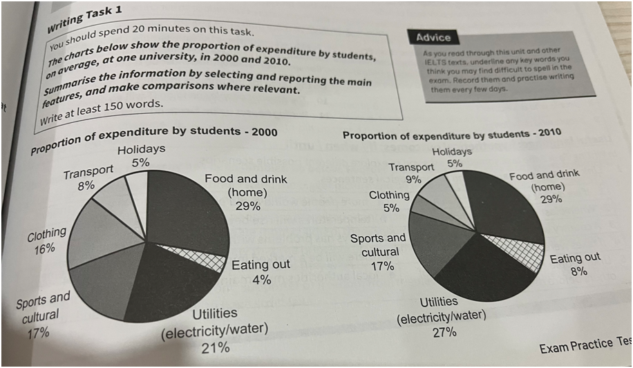
The pie charts illustrate the proportion of money that students at a particular university spent on various areas in the years 2000 and 2010. It can be seen that in both years, students spent the most on food and drink and the proportion of this expenditure was exactly the same at 29% in both years. Utilities were the second biggest expense in both years and the spending on utilities actually increased from 21% in 2000 to 27% in 2010. The spending on sports and cultural was the same in both years at 17%. The most drastic change occurred in the spending on clothing which dropped from 16% in 2000 to just 5% in 2010. Meanwhile eating out expenses doubled from 4% in 2000 to 8% in 2010. While students spent exactly the same proportion of money on holidays in both years (5%), their expenditure on transport slightly increased from 8% in 2000 to 9% in 2010.
Need help with IELTS writing? Get your essays, letters and reports corrected by me.