The Chart Shows The Value Of One Country’s Exports In Various Categories In 2015 And 2016
You should write at least 150 words.
Export Earnings (2015 -2016)
Sample report
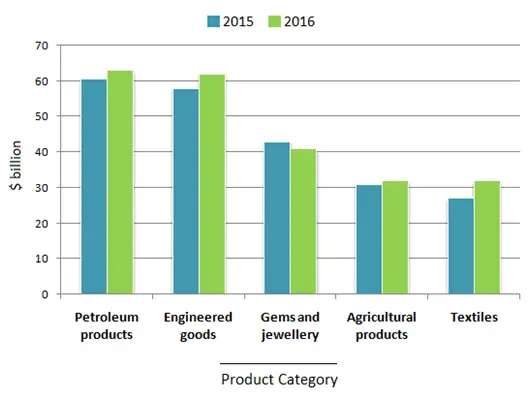
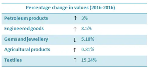
The given chart shows the amount of money that a country earned by exporting petroleum products, engineered goods, gems and jewellery, agricultural products and textiles in the years 2015 and 2016. The table illustrates the percentage change in the value of exports. Overall, it can be seen that except for gems and jewellery, every other sector registered a growth in exports. Textiles industry recorded the highest year on year growth of 15.24%. The export of engineered goods and petroleum products increased by 8.5% and 3% respectively. While in 2015, the export value of textiles was about $27 billion, it rose to $31 billion in 2016. Revenue from the export of both petroleum products and engineered goods crossed $60 billion in 2016. Agricultural products showed only a marginal increase of 0.81% in exports. The export value of gems and jewellery dropped by 5.18% from $42 billion to around $40 billion in 2016.
Need help with IELTS writing? Get your reports, essays and letters corrected by me.