Number Of Trips Made By Children In One Country | Band 7 Academic IELTS Task 1 Report
The chart below shows the number of trips made by children in one country in 1990 and 2020 to travel to and from school using different modes of transport. Summarise the information by selecting and reporting the main features, and make comparisons where relevant.
Here is a band 7 Academic IELTS report on this topic submitted by one of our students. Need help with Academic IELTS writing? Get your writing samples corrected by me.
Band 7 Academic IELTS report sample

The bar graph illustrates the number of trips made by children in a particular country in 1990 and 2010. The five modes of transport were car passenger, walking, cycling, walking with bus and bus. Overall, it can be clearly seen that in 1990, walking was the most popular amongst the five means of transport whilst in 2010, car was the first choice of children for transport. While in 1990 car passenger was the least popular accounting for only about 4 million trips, in 2010 cycling became the least popular with 2 million trips. Most children walked to and from school in 1990 and the total trips amounted to more than 12 million. Taking the bus and cycling were the second and third choice with a total of more than 7 million and 6 million trips per annum. Combination of walking and bus made up a little less than 6 million trips in that year and car transport was the least popular at just over 4 million trips annually. On the other hand, travelling by car became the number one mode of transport for children in 2010 amounting to more than 11.5 million trips yearly. This was followed by walking (6 million trips) and taking the bus (5 million trips). Bus with walking and cycling were the least utilised amongst the five modes and accounted for 2 million and 3 million trips respectively.
Band 8 IELTS Report Sample 2
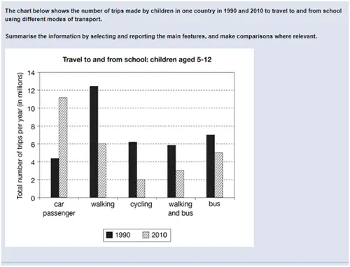
The given chart shows the different modes of transport used by students aged between 5 and 12 to travel to and from school in 1990 and 2010. Overall, it can be seen that the number of car passenger trips more than doubled over the two decades. While the number of passenger car trips in 1990 was roughly 4 million, it increased to 11 million by 2010. In 1990 walking was the most used means of transport to school with more than 12 million walking trips in 1990. Interestingly, it had reduced by more than half to 6 million trips by 2010. There was a significant drop in the number of cycling, walking and bus and bus trips. While the number of cycling and walking and bus trips in 1990 was about 6 million each, it had dropped to 2 million and 3 million respectively by 2010. Cycling was also the least common means of transport used in 2010.
Do you have an essay on this topic? Submit it below in the comments for a free band score estimate.
The below chart describes different types of transport used for the trips made by children in one country for year 1990 and 2010, the total number of trips are measured in millions per year.
The chart as five categories they are car passengers, walking, cycling, walking and bus and bus, the group of children from aged 5 years to 12 years who travel to and from school. The major changes we can see are in car passenger, walking and cycling. Car passenger as been double from the year 1990 and the reverse effect in walking it is half from year 1990.
The car passenger in 1990 had around 5 million trips, it has increased more than twice in year 2010 to 11 million trips in a year. Walking as been declined by half in year 1990 it was more than 12 million but in 2010 it is half, same way cycling as impact on trip by half. In year 1990 it was 6 million and in 2010 it is now only 2 million. Children’s still using buses for there travel purpose it as minimum changes in trips from around 7 million to 5.5 million.
This seems band 6 to me.
The chart illustrates the annual number of travelling routes made by children between their home and schools in 1990 and 2010 using five types of transport:car, walking, cycling, walking and bus and bus. The trip quantity is given in millions.
Overall, the total number of trips made by children aged from five to twelve in the past was bigger than in the recent year. In comparison between 1990 and 2010, there is a tendency of changing from more primitive kinds of transportation to more modern vehicles. While the fluctuation in travelling by bus between the two observed years was not subtaintial, there is significant switch in the way of travelling to and from school of young children in 1990 and 2010.
In the past, the most popular kind of transport for children was walking as the number of the trips completed in 1990 was more than 12 millions. This was approximately as twice as much the amount of trips made by cycling or walking and bus. In this time, car passengers were fewest among the cartegories.
In the opposite, the number of travelling by car trips in 2010 was the highest as it reached about 11 millions. Walking, however, remained the second popular way for children to travell to and from school with the number of trips was about 6 millions. In present, cycling was observed to be in the lowest quantity.
Travelling by bus to and from school maintained its popularity as ran the second position in 1990 and the third place in 2010.
This seems band 6.5 to me.
The given bar chart sets out information about the average proportions for five various, particular ways of transportation to and from school chosen by children of 5_to 12_year_olds, between the years 1990 and 2010, in a country, and was measured in millions. Overall, the two years display vastly different patterns with the car passenger becoming the most popular mode at the end of the period.
In the light of the evidence represented in the chart, it is noticeable that aside from figures for car passenger which rose abruptly, all categories underwent downturns in their factors, predominantly it can be seen in the ratios for walking bracket which was the largest portion at well over 12 million in 1990. This rate had been halved relatively, by 2010. Meanwhile, just over 6 million is shown to be made up of those who were favored to cycle in 1990. Whereas, in 2010, the mode lost its popularity strikingly of around 4 million. There were also two downward trends of approximately 2 million in the number of both types of trips walking and bus and bus.
With regard to the amount of car passenger trips, it became roughly three times higher than it used to be in 2010 which meant that other modes such as walking, cycling and taking the bus were less popular among children in comparison with the year 1990.
This seems band 6.5 to me.
This chart depicts the number of trips taken by students aged between 5 to 12 years old in 1990 and then two decades later in 2010 by using various ways of transport including the car, cycling, walking, walking and using bus and by using the bus only.
Walking was the most popular option in 1990 while most people preferred car in 2010 which was the least preferred option in 1990, while cycling being the least used mode of transportation for trips to school in 2010. Cycling and “walking and bus” were used to a similar extent in 1990, close to the 6M trips per year mark, but no such close relation can be observed in 2010.
The car saw a significant rise in popularity from 1990 to 2010, increasing its utilization by more than 200% while walking experienced nearly two times drop in its preference coming down to 6M trips per year in 2010 from near 12M per year mark of 1990.
People used cycling three times less in 2010 than they used to in 1990. The bus saw relatively the minimal drop of 2M trips in usage in 2010, coming down to 5M trips per year from 7M trips per the year of 1990, while the “walking and bus” experienced a nearly two-fold drop in popularity in 2010, dropping to 3M from near 6M trips per year record of 1990.
This is close to band 7.
The bar graph illustrates the number of trips made by school children aged 5-12 in the years 1990 and 2010 to travel to and from school using 5 means of transportartion, namely walking, car passenger, cycling, walking and bus, and bus.
Overall, many school children preferred to walk to school in the year 1990 whereas children in the year 2010 preffered to travel by car.
In 1990, the most preferred means of travel was walking with more than 12 million trips in that year, almost twice as more as the amount of trips in the year 2010. Taking the bus was also a popular means of transportation with 7 million trips in 1990. Students also cycled, and walked and took the bus to get to school. Car passenger was the least popular mode of transport in comparison to the other 4 means of transportation, with less than 5 million trips in 1990.
However, number of car passenger trips saw a dramatic rise in the year 2010, with more than 11 million trips which made it the most popular means of transportation in that year. Cycling, on the other hand, was the least used means of transportation in 2010, with only 2 million trips which is less than half of that in 1990. Less students preferred travelling to school via walking, with figures plummeting drastically to 6 million trips. The number of trips taken from bus and walking was also cut short to only 3 million trips. Bus trips saw only a slight decrease in comparison to 1990, with almost 5 million trips in 2010.
This seems band 7 to me.
he chart which is being displayed depicts the frequency and types of trips taken by children in a particular country in 1990 and 2010. It can be seen that walking alone was the predominant form of transport taken by children in 1990 with over twelve million trips and is almost twice as the number of children who preferred to travel to and from school by walking and bus combined. It is also shown that children preferred public commutes by taking the bus over cycling or car in 1990.
However, children in 2010, preferred to travel by car over other modes of transport. Over 11 million children travelled by car and this was a significant increase from 1990. It can also been seen that the interest of children walking to school has drastically declined in 2010 since only six million trips via walking were seen to be completed.
This seems band 6.5 to me.
The given chart illustrates the number of trips made by children aged 5-12 years in the years 1990 and 2010 using 5 different modes of transport. The black bar represents data from the year 1990 and the year 2010 is denoted by the shaded bar.
It can be clearly observed that using a car was the least preferred mode of transport in the year 1990,but it became the most popular option in 2010 with about 11 million trips recorded in a calendar year. Walking was the most preferred option in the year 1990 with over 12 million trips, but the number reduced drastically to just 6 million trips in the year 2010.
Apart from walking, the number of students opting for cycling also saw a significant reduction from over 6 million trips in 1990 to just 2 million trips in 2010.
Using a combination of walking and bus, almost became the half the number (about 3 million) from what was observed in 1990. However, the usage of buses did not show a huge decline, as 7 million trips were made in the year 1990 which decreased to just about 5 million in 2010.
Overall, it can be concluded that usage of cars has overtaken the trend of walking as well as cycling among the school children while going to school.
This is close to band 7.
Where should I improve? your suggestions would be very helpful.
Both content and grammar need improvement. Use our writing correction service to get a detailed analysis of your writing with tips to improve your score.
This bar chart gives information about five different modes of transport used by school children in a country to commute to and from school and the total number of trips taken by them using these modes in the year 1990 and 2010.
Overall, walking was the most preferred way of transport in the 1990s while travelling to school in the 2010s was mostly done by car.
In the year 1990 more than 12 million trips were taken on foot almost double than those done by cycling or by walking and taking the bus to and from schools(roughly 6 million).The journeys taken by bus stood at approximately 7 million while those taken with car were just above 4 million.
This picture changed at the turn of the century with car being the most used mode of transport in 2010 with over 11 million trips and cycling remained the least popular with only 2 million trips.As compared to 1990 walking(6 million), taking the bus and walking (about 3 million)and using only the bus(approximately 5 million) declined in popularity.
This seems band 7 to me.
The bar chart illustrates total number of trips per year used by children aged between 5 to 12 years old travelling to and from school using different modes of transport (car passenger, walking, cycling, walking and bus, bus) in the years 1990 and 2010. Units are measured in millions.
Overall, the amount of trips made in 1990 was higher than that of 2010. In 1990, most trips were made via walking whereas in 2010, car passenger was the preferred mode of transport. The least popular choice was cycling and car passenger in 2010 and 1990 respectively.
In terms of car passengers, in 1990 around 4.1million trips where made while in 2010 it was more desirable mode of transport by around 15million. Walking was significantly high in 1990, reaching around 12.1 million however in 2010, there was a decline reaching exactly 6 million. Cycling accounted for 2million trips and was not a personal favourite amongst the children in 2010 meanwhile in 1990, there was an increase of around 4.1million making it around 6.1 million trips.
On the other hand, combination of “walking and bus” made up less than 6 million trips and 3 million trips in 1990 and 2010 respectively. The use of bus throughout 1990 was the second most liked mode of transportation reaching around 7 million, however in 2010 it was the third most popular amongst the five choices at around 5 million trips.
This seems band 6.5 to me.
The bar chart illustrates the number of trips taken by children of age between 5 to 12 years in a particular country in the year 1990 and 2010. For traveling to and from school various modes of commutation were used including car passenger, through walking, cycling, walking and bus and only bus.
Overall, in the beginning walking was the most preferred means of travel among the five modes of transport, while car passenger was used by the children as the least way of commute. In 2010, car was the most popular means of transport for the children, whereas cycling became the last choice of them for trips.
In 1990, children walked for trips accounted for more than 12 millions, while trips taken by cycling and bus reached to around 6 millions and nearly 7 millions per annum respectively. Additionally, number of trips made by combination of walking & bus and the car were the least in figure as less than 6 millions and just over 4 millions.
After a decade, trips taken through car passenger were the highest at around 11 millions, while trips and traveling through walking were the second choice of children with figure at 6 millions annually. Furthermore, making trips by the walking with bus and the bus alone were also famous and amounting for 3 millions and around 5 millions respectively. On the other hand, cycling was the least popular in 2010, accounting for 2 million trips annually.
This seems band 7 to me.
The graph illustrates numbers of travels made by children aged between 5 and 12 years old, comparison take place in two different years (1990 and 2010) showing how differences in numbers take place considering different means of transportation.
As the chart shows, a huge use of car was recorded in 2010, becoming it the most favorite means of transportation in that age, differently from 1990 when that record was gained by walking trips, touching the 13 million.
A drop of nuber of children using the cycle to go to school was recorded in 2010 comparing to 1990 when were more than 6 million the users.
Another relevant inversion of tendency was recorded in the total of children taken the bus, or combinating walk and bus, showing a decrease of more than 2 millions from 1990 to 2010.
Overall, the number of trips made in 1990 was higher than in 2010.
This seems band 6.5 to me,
The bar-chart illustrates the of quantity of trips done the school pupils of age 5-12 using various modes of transport in the years 1990 and 2010. The trips performed by the children were expressed in millions per year.
Overall, walking was the preferred mode of transport in 1900, while passenger car was the most preferred in the year 2010.
Firstly, In 1990, walking was the most preferable means of transport with 12.5 million trips, whereas passenger car was the least preferred among all the modes with 4 millon trips.Further, pupils preferred cycling, walking and bus, and bus with 6,6, and 7 million trips respectively in the year 1990.
On the other hand, in 2010, students highly preferred passenger car with 11.5 million trips, while cycling with only a meagre 2 million trips. Moreover, children showed their enthusiasm towards other modes of transport such as walking,walking and bus, and bus with 6,3, and 5 million trips.
This seems band 6 to me.
The bar chart gives information on how many trips to and from school were made by children in a nation in the years 1990 and 2010 when commuting to school using five transport methods namely car, walking, cycling, a combination of walking and bus, and bus only. It is clear from the chart that while children travelled mostly by on foot in 1990, it had been outstripped by travelling by car in 2010. In addition, most of means of transport shown became less popular, except for commuting by car, which bucked the trend.
More specific, in 1990, schoolchildren made around 4 million trips by car, which bottomed the list, but this number shot up to about 11 million in the next two decades, making car the most preferred choice among children. However, the situation was totally opposite for walking. Children walked to and from school over 12 million trips, which ranked first in 1990, but this figure had declined significantly to only 6 million trips by 2010.
Regarding the three remaining modes of transport, they shared the same pattern as their figures in 1990 ranged from 6-7 million each and then experienced a decrease of varying degrees. In the next 20 years, the bus was still the most popular among these options, with 5 million trips. Simultaneously, the number of bicycle trips was lowest, at only 2 million.
This seems band 6.5 to me.
The chart indicates the types of transport used by the children to get to the school and indicated in trips per year in 1990 and 2020. The age group of the chart is from 5 to 12 and number of trips are indicated in millions.
In 1990, waling is the most dominant form of travel and accounted for more than 12 million trips followed by bus, which is responsible for about 7 million trips. Cycling, waling and bus accounted for about 12 million trips in total whereas the former showed about 0.2 million increase by the latter.
The lowest form of transport is the car passenger which only accounted for only over 4 million, the one third of the most popular mode of transport.
The dramatic increase in car passenger was found in 2020, which crowned for the most popular transport for the year with an increase of about 7 million. Walking went to the second most used mode of transport followed by bus, walking and bus and cycling.
Overall, the domestication of passenger cars results in the most dominant form of transport of 2020 whereas cycling reduced by 4 million trips making it the least popular form of transport.
This seems band 6 to me.
The chart gives information about the private and public transports used to go to school by children of one country over two years, 1990 and 2010 respectively. The figures are measured in milllions.
Overall, in 1990 the most children used to go to school by foot. In contrast, 20 years later walking trips diminished and pupils were mostly brought to school and then picked up by car.
In 1990 a high number of children walked to go to school, therefore the trips reached a figure of little more than 12 million. Another group of pupils travelled by bus (about 7 million trips), while others preferred to go cycling or walking for a while and then taking the bus. Controversely, the car wasn’t used so much (4 million trips).
In 2010 there was a significant increase of travelling by car, indeed the numbers of trips almost tripled. On the other hand, going to school by foot shrinked deeply, reaching a number of two-fold less than in 1990. In contrast, walking and then going by bus as well as cycling showed very few trips, 3 million and 2 million respectively.
This seems band 6.5 to me.
Can you comment me why band 6.5? Thank you 🙂
Would you like a detailed analysis of this essay? You can find details here.
This chart summarises the travel history of children (aged 5-12) in one country in the years 1990 and 2010.
Overall, it can be observed that the children mainly used 5 mediums to travel during this period. In 1990 the children mostly used to travel by walking in contrast to the year 2010, which was replaced by cars. In 1990, only 4 million children used to travel by car, which rose to 11 million in 2010.
We can also observe a significant fall in cycling as well. In 1990, more than 6 million children used to travel by cycle which reduced to 2 million in 2010. Buses are a very significant mode of transport for children at all times, as we do not observe much of a difference in children taking busses to travel. But it still took a drop from 7 million to 5 million in 2010.
Also, they reduced walking and taking a bus over time. Children walking and taking a bus took a dip by nearly 3 million in last 2 decades.
This seems band 6.5 to me.
The chart illustrates how many trips were made by children to travel to and from school using distinct types of transport. in one country from 1990 to 2010
Overall, there was a downward trend in all the brackets of trips made by children using different ways to move to and from school, except for the figure for car passenger. In addition, walking was the most popular method that children chose more likely in the year 1990, although it has been challenged by the figure for those who chose to use cars in 2010.
In 1990, ranking first is the number of trips in which children preferred walking to school, and either when they went from school to home, at 12 million trips, and was triple the figure for trips made by using cars. Regarding the remaining three categories, their figures were around 6 million.
Thereafter, a significant increase to nearly 11 million trips was recorded in car usage rate. However, the walking method was used less and also witnessed a plummet to 6 million, the three other methods got a similar trend and respectively at 2 million, 3 million and 5 million.
This seems band 6.5 to me.